

The Psychology of Colour in Branding: Why Fast Food Brands Use Red (and Coffee Brands Don’t)
Colour is one of the most influential tools in branding. Long before a customer reads a logo, scans a menu or understands a brand story, colour has already shaped their perception and behaviour.
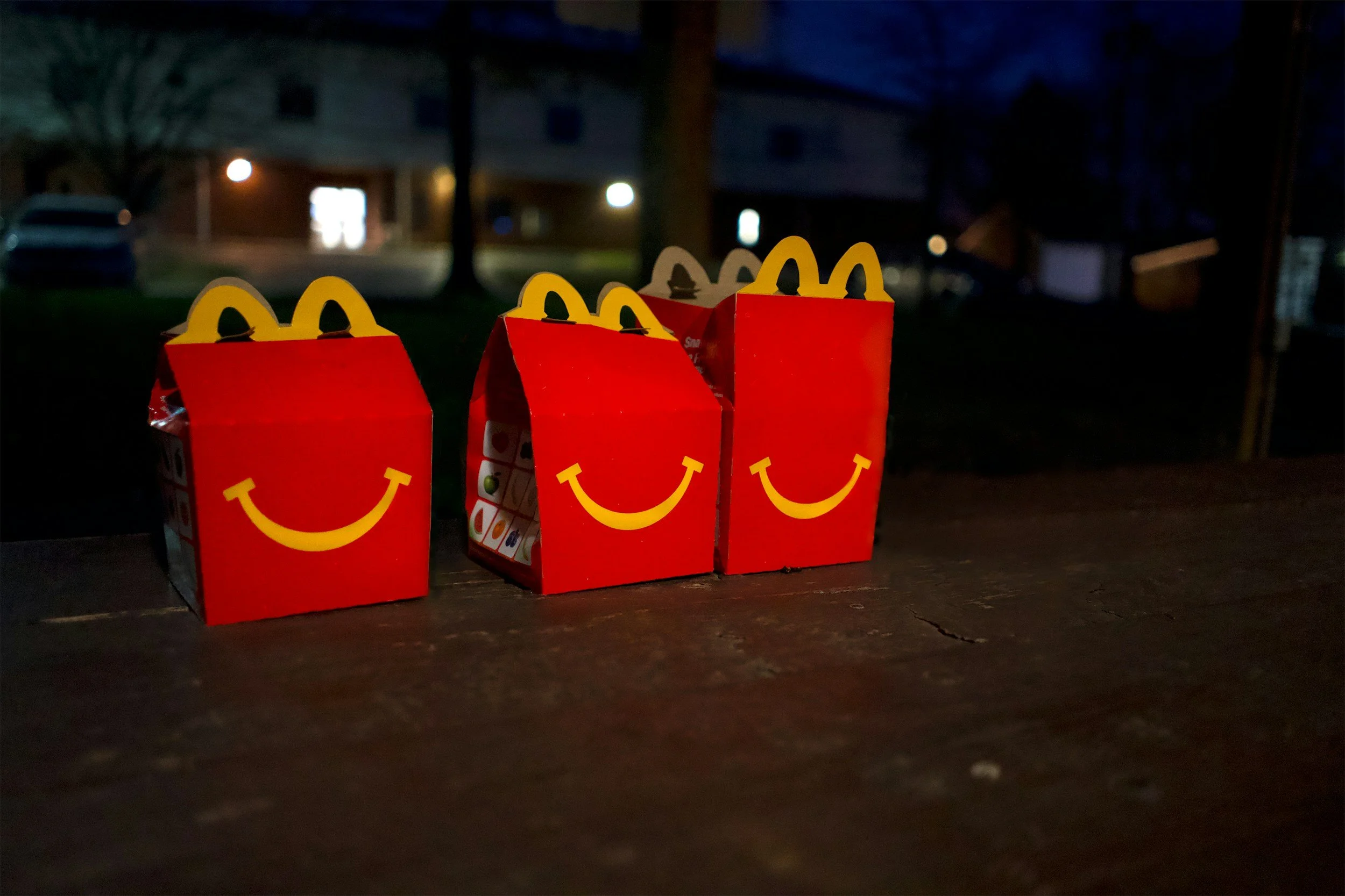
Image source: Unsplash
In food and beverage branding especially, colour psychology plays a critical role in how quickly we decide, how hungry we feel, and how long we stay. Fast food brands like McDonald’s, KFC and Burger King rely heavily on red and yellow, while coffee brands such as Starbucks, Costa and Caffè Nero choose deeper, richer tones.
These decisions are not aesthetic trends — they are strategic.
Why Fast Food Brands Use Red and Yellow
Across the fast food sector, the same colour palette appears again and again. Red, yellow and orange dominate signage, interiors and packaging. This consistency is driven by behavioural psychology and commercial intent.
Red: Appetite, Energy and Urgency
Red is one of the most stimulating colours the human eye processes. It is associated with energy, excitement and urgency, and has been shown to increase heart rate and stimulate appetite.

For fast food brands, red encourages quick decision-making and impulse purchases. It creates a sense of urgency that aligns perfectly with high-turnover, speed-driven business models — whether that’s a drive-thru, food court or high-street location.
Red is also highly visible, making it effective for grabbing attention in busy environments and reinforcing instant brand recognition.
Yellow: Happiness, Speed and Visibility
Yellow is often paired with red because it communicates warmth, friendliness and optimism. It feels accessible and familiar, which is essential for mass-market food brands targeting a wide demographic.
From a functional perspective, yellow is one of the most visible colours in daylight, making it ideal for signage that needs to be recognised quickly and from a distance.
When combined with red, yellow reinforces the idea of fast, easy and satisfying food — with no friction or hesitation.

The Red and Yellow Combination
Together, red and yellow form one of the most powerful colour pairings in commercial branding. The combination creates emotional warmth while encouraging speed and action. It subtly signals to customers that the experience will be quick, satisfying and low commitment.
“When you combine red and yellow it’s about speed, quickness. In, eat and out again.”
This is why the palette is so effective for fast food — and why it would feel completely wrong for brands positioning themselves around craft, quality or slow enjoyment.
Why Coffee Brands Use Darker, Richer Colours
Coffee brands take a deliberately different approach to colour because their business model and customer behaviour are different. Rather than encouraging speed, they aim to encourage dwell time, loyalty and perceived quality.
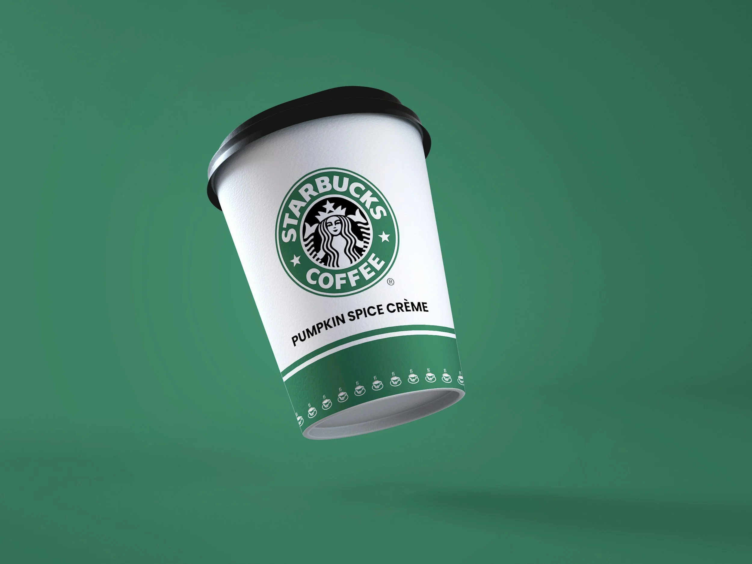
Image source: Unsplash
Starbucks Green: Calm, Growth and Sustainability
Starbucks’ green is closely associated with nature, balance and sustainability. It supports the brand’s positioning around ethical sourcing, community and comfort.
Green also has a calming effect, which encourages customers to stay longer — turning coffee shops into workspaces, meeting places and social hubs rather than transactional pit stops.
Costa DEEP Red: Warmth with Heritage
Costa uses red, but in a deeper, richer tone than fast food brands. This red feels warmer and more grounded, referencing heritage, Italian coffee culture and craftsmanship rather than urgency.
The colour still conveys energy, but without the aggressive stimulation associated with fast food branding.
Caffè Nero Blue: Trust and Sophistication
Blue is rarely used in fast food branding because it suppresses appetite. In coffee branding, however, it works differently.
Caffè Nero’s deep blue communicates trust, sophistication and calm. It reinforces a premium, relaxed environment where customers are encouraged to stay longer and associate the brand with quality rather than speed.
What This Means for Your Brand
Colour is not decoration — it is strategy.
Different colours encourage different behaviours:
Red, yellow and orange drive urgency, appetite and impulse decisions
Green, blue and darker tones encourage calm, trust, quality and longer engagement
Choosing the wrong colour palette can undermine your positioning, no matter how strong your product or messaging is. Your brand colours should align with how you want customers to feel and behave, not just how you want the brand to look.
Final Thoughts: Colour as a Strategic Branding Tool
Fast food brands use red because it works. It stimulates appetite, drives quick decisions and supports a high-volume business model.
Coffee brands avoid these colours because they want the opposite effect — depth, calm and connection.
When developing or evolving a brand, colour should always be considered through a strategic lens. It sets expectations instantly and influences behaviour long before words are read.
If your brand isn’t getting the response you expect, colour is often one of the first places to look.
If you’re building or evolving a brand and unsure whether your colour palette truly supports your strategy, this is exactly where brand clarity work can make the biggest difference.